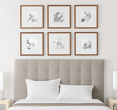
FRAME WALL ARRANGEMENTS
GRID
A simple grid is the easiest way to fill a wall and to build on over time. This design creates a strong, modern focal point.

- Consider the grouping of frames as one piece and center it over your furniture. If there's no furniture along the wall, balance the composition with the entire wall space, top to bottom and left to right.
- Leave an even amount of space (about two inches) between each frame for consistency.

MIXED GRID
This arrangement balances a feeling of movement with symmetry. You can easily add to this arrangement over the years.

- Leave approximately five inches from the top of the piece of furniture to the bottom of your lowest frame.
-
HORIZONTAL
A row of frames makes a strong graphic statement and visually widens the room.
- Give your arrangement a unified look by using images in a cohesive color palette.
- To ensure your frames are in scale whether you're sitting or standing, leave about six inches from the highest point of your sofa cushions to the bottom of the frames. Fluff, then measure.
- Use just two frame sizes to create this pattern, which aligns the frames to a vertical or horizontal axis.


